


Where strategy builds your brand. 策略先行,讓設計真正發揮作用
Philosophy
重新對焦品牌核心,讓每分預算都有回應
LCB 是一間以策略為核心的品牌設計工作室,由創辦人親自主導每一個專案。我們相信好的設計不只關乎美感,更要能解決問題、傳遞價值、驅動品牌成長。


Case Study


Partners in Growth.
我們不稱他們為客戶,而是我們的戰友。 我們將自己視為客戶團隊的延伸 ,以誠實與同理心並肩作戰。 因為我們深信,客戶品牌的健康成長,是我們唯一的成功指標 。
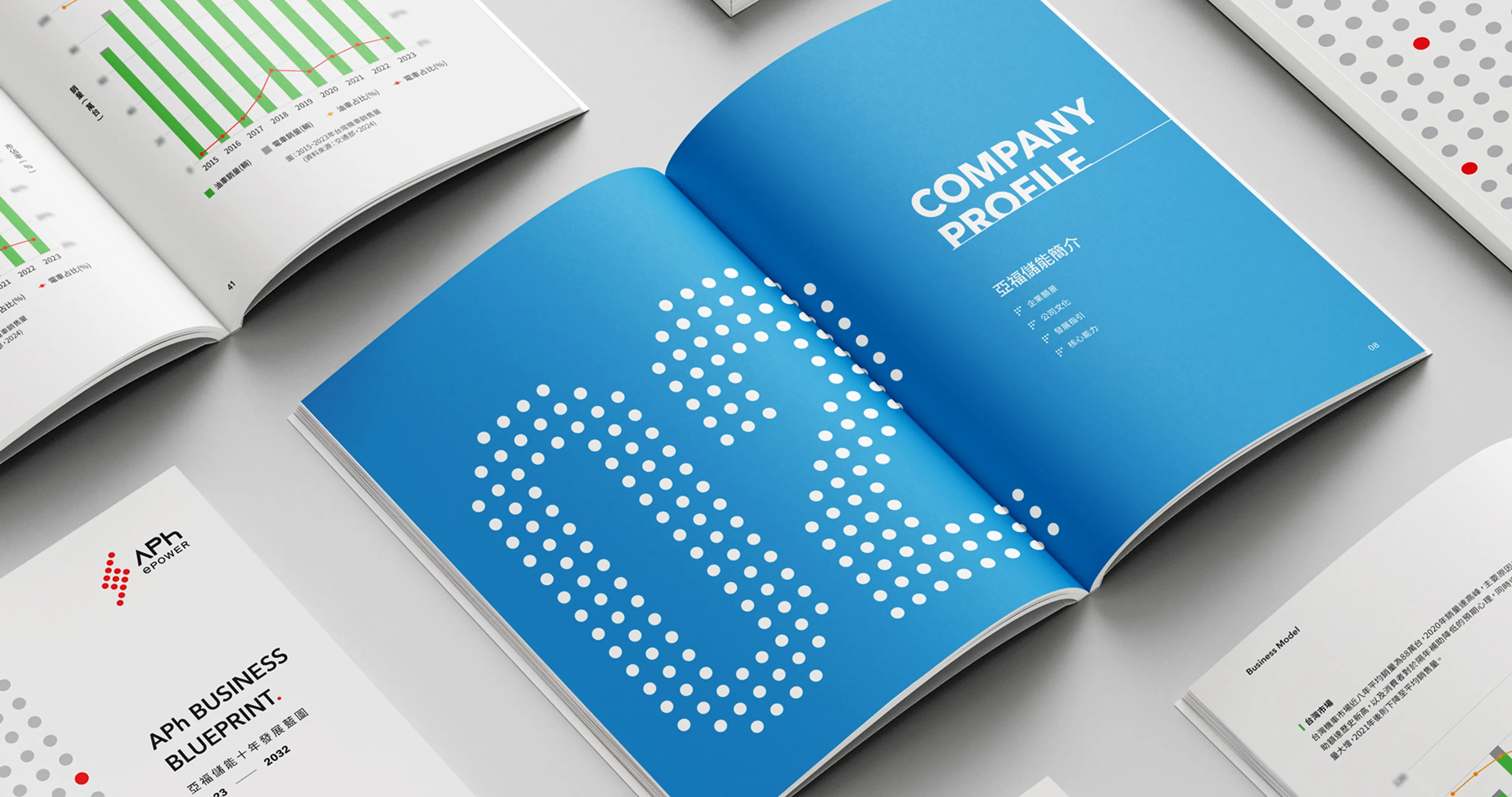
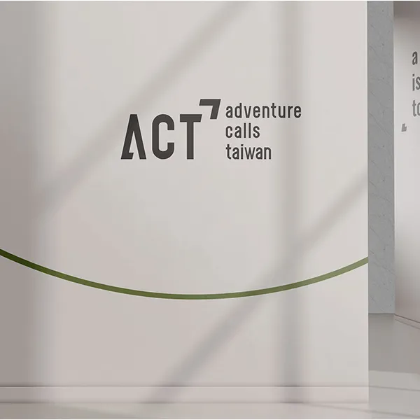
![Client [object Object]](/_astro/01.C_cSPzbJ_Zfbwz9.webp)
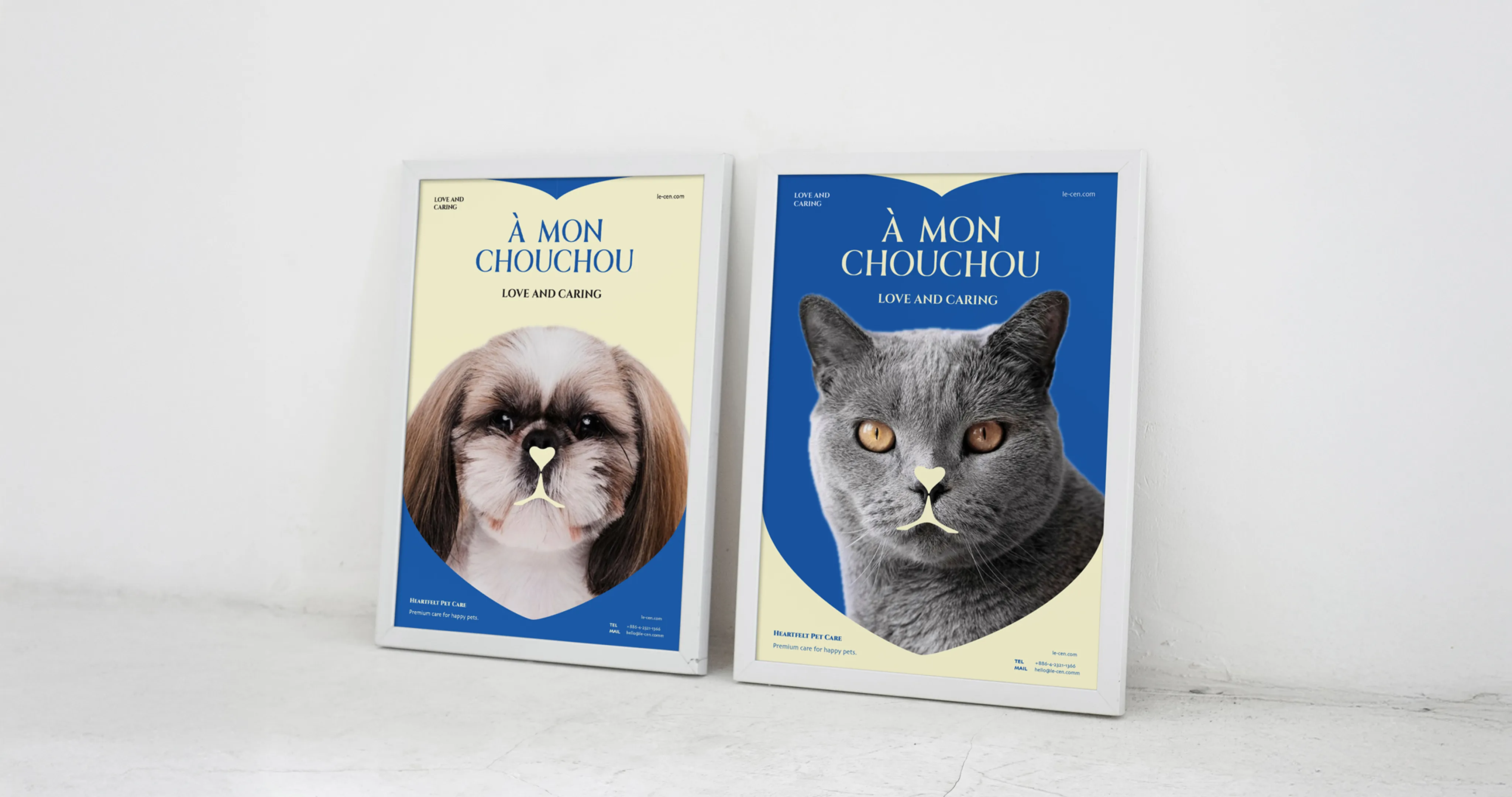
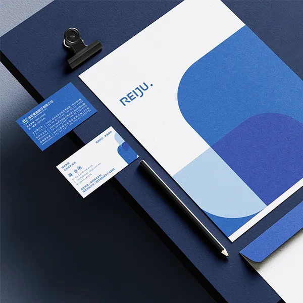
![Client [object Object]](/_astro/02.Bscic6FT_Z272oT1.webp)
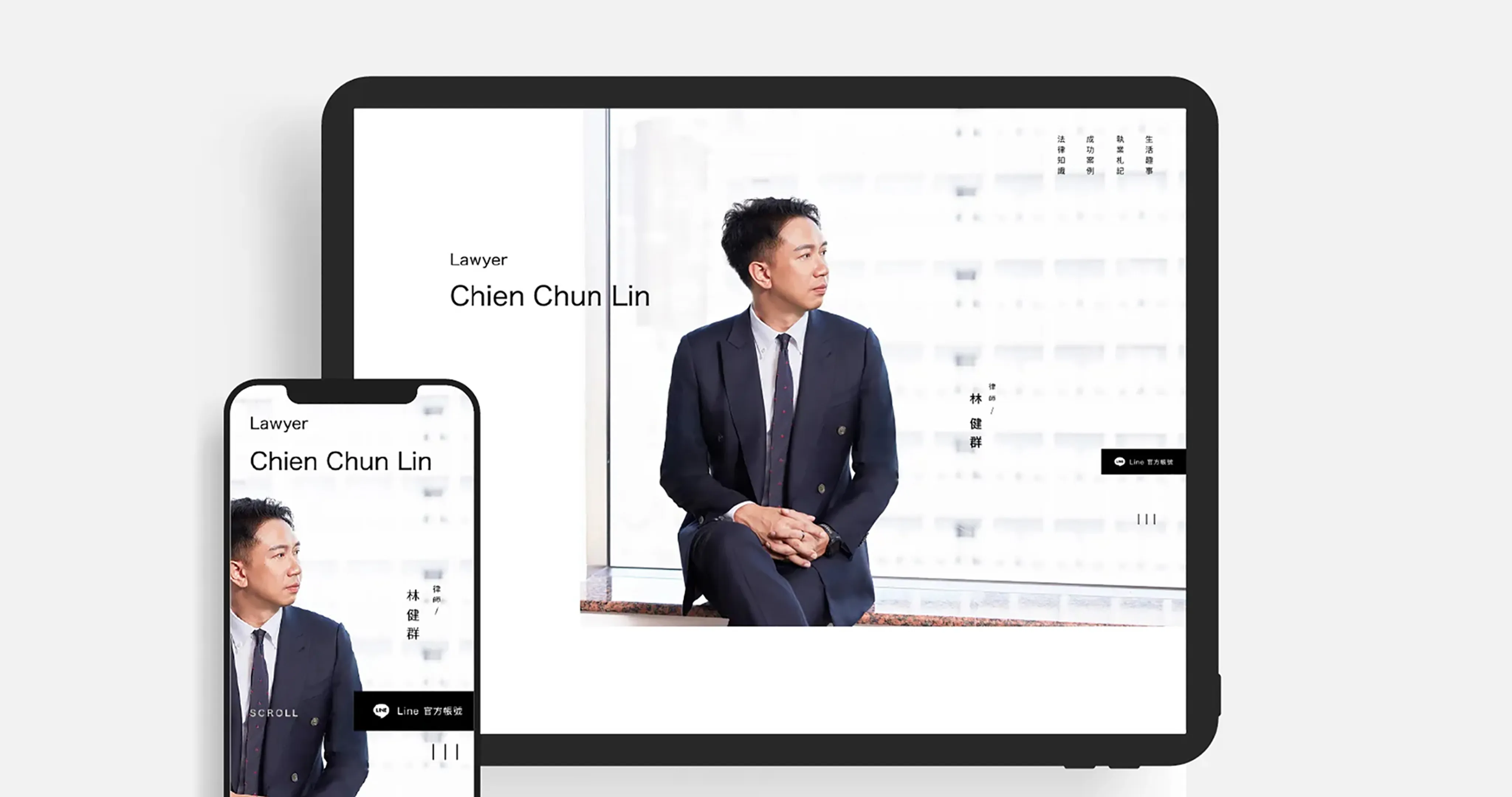
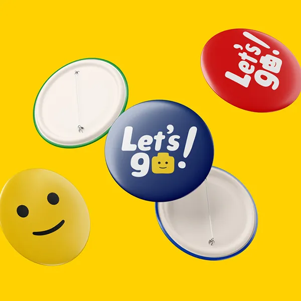
![Client [object Object]](/_astro/03.C7PELQTD_1e4Qhs.webp)
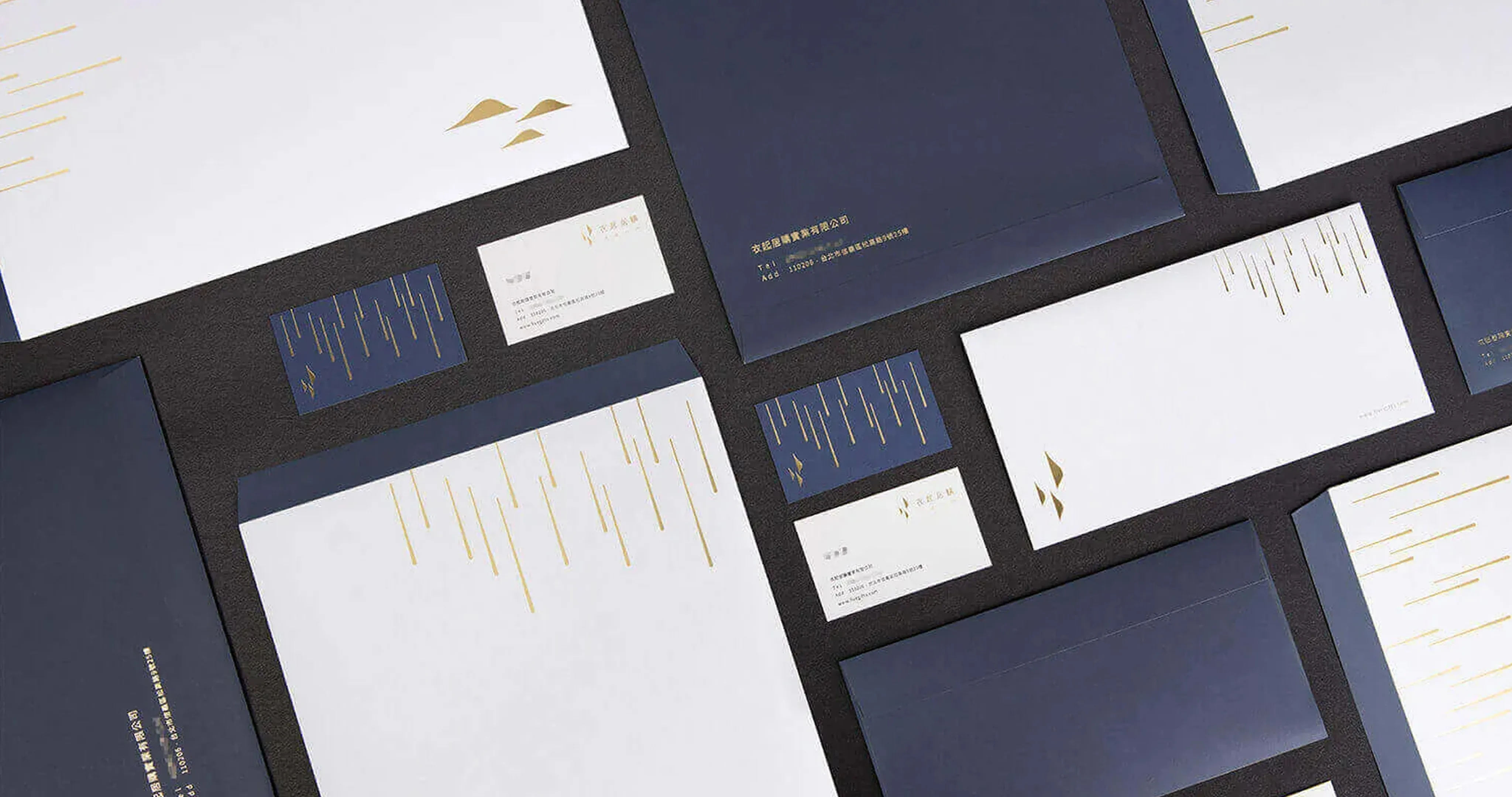
![Client [object Object]](/_astro/04.DdRhxq0i_Z1tbwQ8.webp)
![Client [object Object]](/_astro/05.C8IYglsY_Z2uIzWz.webp)
![Client [object Object]](/_astro/06.CfjMZLv5_aJBlt.webp)
![Client [object Object]](/_astro/07.F7rD_x4e_Z1PixGa.webp)
![Client [object Object]](/_astro/08.UC71J5Ss_14bfVo.webp)
![Client [object Object]](/_astro/09.1N4Ish9W_Z2lsoaM.webp)
![Client [object Object]](/_astro/10.BvWx6Yf8_Z257aPh.webp)
![Client [object Object]](/_astro/11.Dbtd__Qi_tSqKC.webp)
![Client [object Object]](/_astro/12.DZNTxfR2_1k7KAE.webp)
![Client [object Object]](/_astro/13.BadiVty0_25fBeP.webp)
![Client [object Object]](/_astro/14.CC3N0MCH_Z2kL2j1.webp)
![Client [object Object]](/_astro/15.CMhlhK0B_1avDNG.webp)
![Client [object Object]](/_astro/16.CpGMwG4M_Z1tGXAt.webp)
![Client [object Object]](/_astro/17.Aj4DqRtc_pub8W.webp)
![Client [object Object]](/_astro/18.BGl541T6_1K5J7d.webp)
![Client [object Object]](/_astro/19.D-nUDR24_C0113.webp)
![Client [object Object]](/_astro/20.f0-dIjKM_Z4ceH2.webp)
![Client [object Object]](/_astro/21.8KMN6LO1_Z1S4lxR.webp)
![Client [object Object]](/_astro/22.C9rXdAtZ_Z1cWD5d.webp)
![Client [object Object]](/_astro/23.CnOYvwwg_Z1uIhjT.webp)
![Client [object Object]](/_astro/24.ULhABrcS_Z1Oqodl.webp)
Strategy First. Design That Works.
洞察品牌真實病灶的深度診斷服務
您的品牌健康嗎?
許多企業投入大量資源,卻始終看不見預期成果。這往往不是努力不足,而是品牌「體質」出了問題 。
在樂岑,我們是您品牌的專屬醫師,不做治標不治本的美化 。
我們堅持「策略先行」 ,透過精準的「診斷」 ,找到影響成長的關鍵基因 。接著,才為您開立兼具深度策略與美學創意的「處方」 ,驅動真實且永續的商業成果 。